Ironhack Challenge 3: Usability Evaluation and Site Redesign
One of my greatest passions is travelling, so when I found out that for this challenge I had to step into the shoes of a world traveler for a case study, I got excited! My first task was to choose a destination to focus on. I chose the Colosseum in Rome, Italy as it is just a stone’s throw away from Madrid (where I live), making it a very realistic option for a weekend getaway with my friends.

Objectives
My goals for this UI/UX case study were to:
- Analyse travel apps to identify painpoints for users
- Conduct usability tests to confirm areas of friction or uncover new ones
- Wireframe my ideas to resolve these painpoints
User Type
With my destination set, I decided that I would focus on users travelling in a young group as I would have the most access to this user type in order to later conduct my usability tests.
Young group — 20–40 y/o (4)
You and your friends have decided to invest and spend some quality time together. You are planning your trip one year in advance to really make it happen and accommodate everybody’s schedules and needs. You’d like to share as much time together and plan for a lot of fun. You’re interested in a mix of culture and leisure. You have all saved for the last year for the trip so, while you’re still price-conscious this is the opportunity to spoil yourselves.
Research
The scenario was now set and it was time to delve into the logistic details of the trip to really understand our users’ needs:
- Rome has 2 airports: Rome Fiumicino Airport (FCO) and Rome Ciampino Airport (CIA). Although Ciampino airport is considerably smaller and closer to Rome, both airports are equally well connected to the city centre and offer flights from low-cost companies.
- The most used form of transportation to and from Rome airports is the airport shuttle bus as it is the quickest and the most economic option.
- Both Italy and Spain are in the European Union. This not only means that there is no need to exchange currency as they both use Euros, but you can also travel using just your ID document, you don’t even need a passport!
- The weather in Rome and Madrid is quite similar at all times of the year, which makes it easy to decide what to pack. Rome reaches temperatures of over 40 degrees in the summer, so it is recommended to travel in Spring or Autumn as Rome is a city where you’ll want to walk everywhere!
- As the logistics of getting to Rome are so easy, our young group could visit just for the weekend, although they will probably want to stay a couple of days longer to enjoy more Italian cuisine and beautiful sights together.
Benchmarking
Now that I better understood my users, I was ready to conduct a Usability Heuristics Evaluation to benchmark which travel website would best serve their needs. I tested Skyscanner, Kayak and Trip Advisor using the 5 of Nielsen’s principles which I thought would be most important to my user type while booking their holiday. I collected some insights and used the following scale to see which website performed best: 3=good, 2=ok, 1=bad

- Although all 3 websites show the dates of filghts, hotels or activities at the top of the screen, if you scroll down these dates disapear, forcing the user to rely on recall.
- When editing dates, Skyscanner and Trip Advisor update your search automatically. Kayak requires you to press search to confirm it is action you really want to take, preventing errors.
- Trip Advisor’s homepage doesn’t offer flight bookings. In order to book a flight, the user must first navigate to hotel or activities booking pages. This does not match the logical order of looking at flight prices to decide where to go before thinking about what activities to do there.
I decided Kayak would be the best fit for my users as it scored highly and also gives the option to book activities directly from the website, allowing the group to have more fun together on their holiday.
Testing
To make sure that my chosen website was right for young groups, I conducted a 5 Second Test on 5 users using Usability Hub.
100% of users managed to identify that Kayak was a flight comparison site in 5 seconds. Having confirmed that our product is capturing the right audience, it was time to dig deeper.
To identify the users’ main pain points, I observed them completing the following task:
Book a flight and apartment for you and 3 of your friends in the centre of Rome over a weekend in October.
During the tests I picked up on these problems:
- While booking flights, some users became frustrated at the number of clicks to achieve their goal.
- While selecting dates users had to click through every month to reach their desired date.
- While booking stays, users found it difficult to locate the ‘Type of Stay’ option to limit their search to apartments only, one even gave up looking!
- Users that searched for their stay on the map found the top of the screen too busy and were confused by all of the options displayed. The found the ‘price’ and ‘type of stay’ functions most useful.
- Users also found it difficult to adjust the number of people staying to 4 and wrongly assumed that this could be changed once they went through to the booking page.
- One user went back to the home screen after booking their flight as they didn’t realise they could select ‘stays’ directly from the right side panel.
- “Oh, I wish I could share this directly with a friend, or at least save it”
Insight
Although the users encountered a few problems during the task, the painpoint which stood out the most and which everyone struggled with was filtering their search when choosing where to stay as there were too many options displayed on the screen. I chose to focus on this screen as it was where users struggled most and began sketching out ideas of how this pain point could be resolved:

I also kept my heuristics evaluation in mind as I found that Kayak was weak on recognition rather than recall. Picking the best of my ideas, I decided to create a mid-fi wireframe in order to get a better idea of how my solution would work.
Results

In my redesign, I only changed one thing on the ‘stay’ search page. I chose to highlight the filter for number of rooms and guests as a couple of my users missed it when performing their set task.

For this wireframe, I changed the filter options to the top of the screen and condensed them into a filter button so as not to distract from the ‘stay’ results. I kept the ‘price’ and ‘type of stay’ filters visible as these proved the most useful during testing and provide easy access. If I had time to redesign the map page it would use the same top bar as the current one is too busy and confused users.
I also added a save and share function and changed the format of the ‘stay’ results to vertical as getting rid of the filter sidebar created space to display 3 stays at once. I maintained the advertising on the right in order to respect the business goals.
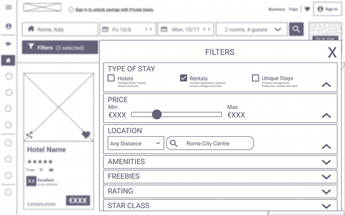
I chose to keep the most important filters expanded as a default to reduce the number of clicks needed. I also combined filters under broader categories to make the interface more clear and simple.

Once the user has chosen their filters, the most important ones are displayed on the top bar to provide recognition to the user and allow for easy editing.
Here is the interactive prototype I used to validate my design solutions: Click Here
Through the prototype I implemented my idea of fixing the search bar at the top of the screen to fix the recognition/recall issue and also to allow the user to edit their search no matter how far down they’ve scrolled.
What did I learn?
This task really opened my eyes to how combining different types of usability testing can give you much better results. The problems I identified during my heuristics evaluation helped me think about the details of the website, whereas the user tests highlighted the major pain points that I should tackle.
If I had more time I would have liked to work on the problems that users found with flight bookings, but I will have to leave that for a later post!
Thank you for reading :)


