Site Redesign: Miss Mariquita (Case Study)
Brief: Redesign a website for a local business.
Miss Mariquita is a local clothing store based in Lugo, Spain. It is full of local charm and works purely with Spanish brands. They offer fun clothes with original designs and a retro touch.

Objectives
Our team of 4: Juncal Juaniz, Julián Casado, Mia Escorihuela and I) set our sights on Miss Mariquita as we were drawn to the passion and work that the owner, Nuria, has visibly put into the store.
Our goal was to help her improve the online presence of the store and become more competitive in the market through a user-centred redesign.
Competetive analysis
After conducting a competetive and business analysis on the company, we identified that the main weakness of the current website was the information architecture. Items were repeated in different categories, and the categories themselves were not intuitive.

User Research
We then turned directly to the users to learn about their pain points and habits related to online shopping through surveys and interviews.
Our user research highlighted an important feature missing from Miss Mariquita’s website: filters. We found that 87% of users use filters when browsing a clothing website. With such a high percentage of users utilizing this feature, it became one of our main focuses during the redesign.
A pain point that repeated itself again and again in all of our user interviews was the lack of confidence in how the clothes will fit. The surveys also showed that this was the main reason why users don’t buy clothes online, despite having other online-buying habits. We saw this as an important opportunity to increase Nuria’s user base.
User Persona

After pooling together all of our research, we used it to create our User Persona, Sandra Navarra. Sandra helped us to better define and understand our user as well as to validate our ideas.
The 3 main problems we identified really began to make sense when we created Sandra’s user journey. Now that we had the problems clearly defined, we began to think of solutions by creating a User Scenario.

Solutions
Now it was time to get all of our ideas down on paper. After a big brainstorming session, we set about organising our post-its into an affinity diagram. From the diagram we were able to identify opportunities which we rephrased into ‘How Might We’ questions. This led to a second brainstorming session to come up with ansers for these questions.

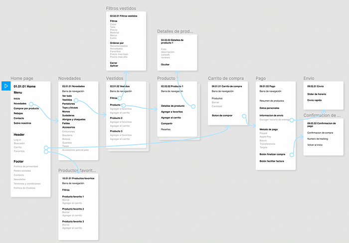
After conducting an audit of the current content structure, we built a Site Map in order to organise the information architecture of the website. We used it to help us visualise the navigation and labeling within the page in order to minimize any confusion that a visitor might have when navigating or interacting with the content. We reinforced our decisions with a Card Sorting test. The results showed that there was no need for repeated discounts (which were present in the current site), and that technical terms for clothing items weren’t understood by many.

Everything started to come together when we began with the user flow. Here, decisions were made about what would be included in each page and how the user would navegate through the website. We were able to better understand how our solutions would work: what users would be able to filter by, what categories would be included and where the customer reviews would come in.

Wireframes

Now that we had the solution clear in our minds, we got to work on the prototype.
As you can see from the prototype, we included a video catwalk, the model’s height, and customer reviews to the product page in order to give the user a better idea of how the product will fit.
Outcomes
We tested our prototype using Maze and found that our design was validated! All 8 users successfully completed their purchase via the expected path in under 1 minute. The average time taken was 32 seconds which we were pleased with as an expert took 20s to complete the task.
Looking ahead
We would have liked to improve the returns system of Miss Mariquita as it proved to be a big pain point during our user research. Due to the constraints of the project, we chose to focus on the other 3 pain points as they would help us achieve our goal of expanding Nuria’s user base. In order to retain the new customers gained from this redesign, we would like to undergo a second sprint to focus more on returns and the UI.
